What does your website say about you? More and more often this question is coming to light for bloggers, personalities, brands, and international corporations. Your general presence on the web is not something superficial. It might seem that way because cyberspace is not something you can tangibly touch, but the exposure it can gain arguably makes it one of your most important assets.
Your website should be a great balance between attractiveness, UI navigability, utility, reliability and general versatility. We’re here to explore all of these, and to find how each of these (good and bad) can contribute to your overall image and presence on the web.
Advertising
Websites for the most part do use advertising. It’s’ a natural way for your business to gain some passive income, especially if you rarely sell products. This is ideal for content driven websites, such as think piece blogs or journalistic website offerings. All of these contribute plenty to the cultural conversation, but not if hidden behind a wall of adverts. A bad user interface with too many flashing, large advertisements can turn a visitor off immediately, and they’ll likely find a better alternative.
Most web users are now utilising ad blocking software to overcome the most heinous of web page adverts. This completely blocks all ability for your website to present (and thus monetize) your content. There are ways around this. Counter ad-blockers exist to gate access to certain webpages (or the whole of your website,) if you find that this is hampering your revenue stream too much. However, this can also turn off a prospective client immediately, as it comes across aggressively.
A polite message popping up asking if the user might turn off their ad blocker will always work best. This popup needn’t gate access, but it can peaceful request a user to think again when visiting smaller websites. More and more people are starting to realize that websites need these advertisements to survive on the macro scale, meaning that they are receptive to switching it off in the right context.
When it comes to the public perception of your brand, this can work wonders. Politely requesting this implement is allowed access will make the user feel you are reasonable, respectful, and worthy of their input. Never gate access, instead approach in an affable manner. You’ll notice the difference within weeks.
Clarity
What does your website offer? How can you best communicate this to the visitor? Do you have plenty of different menus for someone to travel through in order to search your page, or do you have a search bar localized immediately? Do you explain to the client exactly what your websites utility is?
Customers needs a complete and total overview of what your website offers within a matter of minutes. They’re not looking for complexity, difficulty or to cryptically figure out a riddle in order to find what they desire. Again, this all comes down to respect. Do you respect the time of your visitor? If yes, they should be able to find what they want almost immediately. A good metric to use states that a user should only ever be two pages away (at most) from what they’re looking for.
For this reason, many websites use a drop-down menu or search bar featured prominently no matter what page you head to. This basically tells the visitor that they are important, that your business is transparent, and that you appreciate their visitation. Remember, the best websites always tailor how they navigate around the experience of the end user, no what looks attractive or might win web design awards.
Your website should also use clarity in design. This means that using simple color palettes is always preferable to the opposite here. Uniform website design, with crisp, sleek angles and maybe one to three colors will translate into a minimalist, attractive and well-designed website. Also, consider your fonts. While using cursive fonts might be a tempting way to present your business as intelligent and regal, it can generally be hard to read.
Consider what would look best on all digital platforms, such as smartphones, desktops, tablets and laptops. Heading for the aforementioned sleek and minimalist UI will also allow the web page to load more quickly. This is known as being ‘lightweight.’ Believe us, the difference between websites that make use of this compared to those that don’t is tangible. While your UI and color palette may not be to the tastes of everyone visiting, you can be completely sure that a visitor will appreciate simplicity. They are not there to be impressed by the genius of your design, rather there to learn, utilize and contact your firm. Allow them every opportunity to do so.
Intrusiveness
You must never, ever, ever, ever use intrusive methods of grabbing the user’s attention. This is the quickest way to alienate those taking time out of their day to visit. They also look terrible. For example, popup windows are now absolutely avoidable, as it causes inconvenience and annoyance on the side of the client.
You might see some websites using in page popups. This can be just as off-putting. If you’ve ever been to a website which shows you a live chat popup window in the corner, asking you to input a query or to contact support, you might have felt like this bordered on the popup phenomenon. Visitors are savvy, they know what artificial features look like on a web page.
Building your own website well depends on how smart you are with the extra features you use. We’d recommend the most (THE MOST) you’d ever use is a popup on the web page itself, politely recommending that someone joins your mailing list. This should be easy to click way from to bring you back to the focus of the page. This usually seems like a less offensive and intrusive request on the part of your website.
Another feature you might make use of is the ‘notification’ offering. Many browsers (if your website offers this,) will now allow you to automatically subscribe to the RSS feed of a chosen website. This allows you to receive desktop notifications when a new post is submitted, or new content is featured.
Websites from the smallest clothes stores to international giants like YouTube are beginning to use this feature, so it’s worth looking into. Until the day that this becomes unfashionable (it might) it’s best to take part in the oversaturation of this and potentially profit as opposed to not at all. This feature is not in any way annoying, simply an option, so your website will preserve its professional and affable charm if you decide in favor.
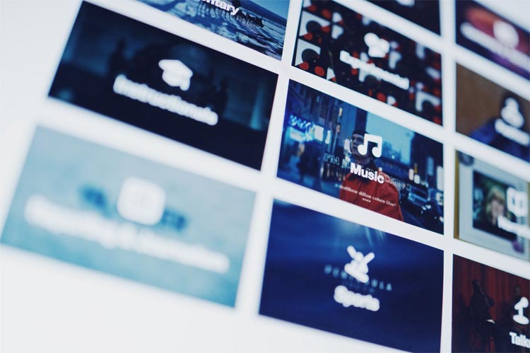
Graphic Design
Graphic design is not something you can get immediately correct. It’s something which must be worked on, and developed to best suit the necessities of your brand. A logo for a brewery is likely to be much different than a logo for a children’s clothing firm for example. It’s important to whittle down your graphic design to a theme you can promote and keep uniform throughout your entire website.
You should think very carefully about what message you hope to give. What is your business focused on, and how do you hope to promote that to the client? For example, let’s take two different examples. Let’s say you’re an online classic car restoration firm. You accept vehicles, tailor them to the needs of your client, and redeliver. Should you allocate your graphic design around the nuts ‘n’ bolts aesthetic, featuring the same feeling as a dirty but efficient mechanics can give? Or should you focus on the end product you offer, with sleek, minimal and contemporary vintage design? It all depends on what client you’re hoping to attract, and how you hope to promote your business now and in the future.
Your graphic design (no matter how you wish to look) should always fit with the theming and navigability of your website. If you are unable to do this, you’ll see that the website feels fragmented, which then translates into the public perception of your business model.
Simple is always better, even from a graphic design perspective, but never be afraid of creative flair. This can help distinguish yourself from the competition, and maybe even seem like a fun business worth approaching.
You
If you’re not featured on your website in the form of a picture, a personal message and your working history, your business might be seen as faceless. Of course, when you get to a certain size this might be rectified. However, if you run a small business, you should feel confident in presenting yourself to the world alongside it. If a visitor sees this on screen they are much more likely to feel that you’re proud of the firm you’ve built, to the point where you’re happy to display yourself prominently in the about section or even on the homepage.
Between someone who does this and someone who doesn’t, we know who we’d rather trust.
Your business can flourish with an excellent website if you allow it, but only if you pay attention to how you are perceived through all aspects of its design. We hope these tips have helped.
Featured Image Source: Pexels